How to Make a Warning Go Viral
You scroll past a tweet from a government account. “Important Health Notice.” Your thumb keeps going. You barely noticed it—no image, no emotion, just… blah.
But here’s the wild part: science says it’s not you. It’s the message.
According to new research, how a government warns you during a health crisis can significantly impact your reaction. And get this—it’s not just what they say, it’s how they say it. From emoji use to message length to whether the disease is scary-new or boring-old, every tiny design choice influences whether you care… or scroll.
This isn’t just a study of hashtags and hyperlinks. It’s a blueprint for saving lives in a digital world.
When a Pandemic Hits, Your Phone Becomes a Lifeline
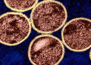
Researchers dug into over 2,000 warning posts on Sina Weibo (China’s Twitter) from verified government accounts during the early stages of COVID-19 and an H1N1 flu resurgence. They wanted to know: which posts made people like, share, or comment—and which ones flopped?
To decode this, they pulled out the big guns: the Elaboration Likelihood Model (aka how your brain decides to care about something) and the Crisis and Emergency Risk Communication (CERC) framework (aka how to not start a panic or put people to sleep).
In short: if you want people to act fast, you need to write smart.
Warning Labels for the Digital Age
So what actually works? Here are the juicy takeaways:
1. Use Positive Vibes, Not Just Doom
Forget the all-caps scare tactics. Posts with a positive emotional tone—like hope, support, or encouragement—got more engagement. People are more likely to trust and share messages that sound like “We’ve got this” instead of “RUN!”
Think: “Together, we can stop the spread 💪”
Not: “THIS VIRUS WILL KILL YOU”
Why? Positive messages don’t just feel better. They make us more curious, open-minded, and ready to act.
2. Pack in the Warning Details—But Don’t Overdo It
Posts with more warning elements—what’s happening, where, what to do, who’s saying it—got more clicks and shares. But there’s a catch: longer isn’t always better.
The sweet spot? Somewhere in the middle. Too short, and you sound vague. Too long, and people glaze over. The relationship follows an inverted U: just right = max impact.
3. Rich Media = Big Results
Posts with photos or videos skyrocketed in engagement, especially during scary, unfamiliar outbreaks like COVID-19. Visuals helped people get it faster. Think animated graphs, zoomed-in maps, or a quick explainer vid on symptoms.
Pro tip: If your post doesn’t make you want to stop scrolling, it probably won’t work for anyone else.
4. Mix Up Your Sentence Styles
Posts with a mix of questions, exclamations, and regular statements stood out. Why?
Because they felt like real people wrote them.
“What can YOU do to stop the flu? Wash your hands. Wear a mask. Protect your family!”
That’s engaging, not robotic.
Who Says It Matters
Accounts with more followers and frequent activity got way more engagement. It’s not just the message—it’s who delivers it. People pay attention to accounts that already have a crowd and show up consistently.
So if a government agency only posts once every two weeks? Yeah, don’t expect people to care during a crisis.
Emerging vs. Re-Emerging Diseases: Not All Warnings Are Equal
Here’s a curveball: messages about emerging diseases (like COVID-19) need to be flashier. Rich media, clear action steps, and emotional punch work best.
But when the disease is familiar (like H1N1)? People tend to tune out. You’ve got to work harder to capture attention because folks assume they’ve seen it all before.
What This Means for the Next Crisis (and For You)
The TL;DR of this research? Crisis communication isn’t just a public service—it’s a design challenge.
A well-crafted post can steer thousands toward safety. A poorly written one? It’s just noise in the doomscroll.
Governments, nonprofits, and even school districts can learn a lot here. So can anyone running a health org’s social media.
Next time you’re tasked with crafting that urgent message, remember:
- Keep it clear, not cold.
- Mix text with images or video.
- Aim for emotionally real, not emotionally manipulative.
- And if you’re warning about something new? Go big or go unread.
Let’s Explore Together
This research doesn’t just explain why some warnings flop—it gives us tools to do better.
So now it’s your turn:
🧠 How do you think your city’s public health team could improve their alerts?
📱 What’s the last health warning you actually paid attention to—and why?
🔍 What would you do differently if you ran a government crisis account?
Drop your thoughts in the comments or tag us on social. Let’s crowdsource better warnings—because next time, it might really be a matter of life and death.
You’re Missing the Headlines That Matter
🚨 Critical science is unfolding—are you in the loop?
Each week, This Week in Public Health delivers need-to-know insights that shape policy, practice, and community health. If you’re not reading it, you’re already behind.👉 Subscribe for free now to stay ahead.
📢 Share this blog—someone you know needs to see it too.