Catching up with…Racism and Health
Recently, we wrote about recent trends in health equity research. Health equity is growing in prominence among researchers and community practitioners because, well, health outcomes are different for different populations. At PubTrawlr, we find this unacceptable and immoral.
A parallel debate is unfolding about how racism, especially structural racism, should be called out when working toward health equity. Back in April, the CDC explicitly called out that racism was a public health threat, which led to a wide range of responses; some celebratory, some nuanced, some reactionary.
A lot of my parallel work resolves around equity evaluation. I do like to keep my finger on the pulse of research, though. To delve into this topic more deeply, I took a look at research trends that specifically called out the relationships between racism and health. I also tried out some new methods that we hope to put into production at PubTrawlr. Let’s dive in.
I searched PubMed for all articles with either “racis* AND health,” published in the last three months. The * functions as a “wildcard,” meaning the search pulls any words that begin with that letter string. For example, “racis*” will include the words “racist” and “racism” in the search results. I ended up with 470 unique articles.
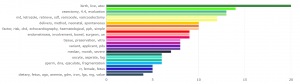
I always like to start with Word Clouds. They aren’t the greatest in terms of identifying precise themes, but can be really helpful in identifying high level overviews. Also, people really seem to like them! Right away, relevant words that jump out at me are structural, systemic, and well, COVID and 19.

Sticking with the descriptive data, I then like to look at a network plot. This shows the relationships between words and word strings, and gets us a little deeper. In this plot, the size of the circle corresponds to the frequency of the word (bigger means more common), and the thickness of the line corresponds to the frequency of the relationship. In addition to the themes centered around health and racism, there are also some methods themes: logistic regression, thematic analysis, & cross-sectional.

Topic Modeling
Let’s take a closer look at how these articles cluster together. Like before, I’m using LDA topic modeling to determine the best configuration of different abstract. From the 50,000 foot level, LDA is just looking for words that occur together often across documents. There’s more to it than that, but that’s the gist. After trying out different clusters, I ended up with 25 unique topics. I took out topic 15 since it was just a string of statistics, though I preserved it in the article recommendations below.
COVID’s right at top. Makes sense. We also have a big topic around public health methods, like health promotion. Other interest topics seem to be neighborhood factors (see walkability), LGBTQ issues, and postpartum disparities.

The above figure just tells us what people are writing about, not what the interrelationships might be. I recently read a super interesting Medium post by Ramya Balakrishnan on how to make topic models easier to interpret, so I implemented some of these methods.
The below figure is a correlation matrix between topics. The size of the circle corresponds to the size of the topic, like in the network plot above. The thickness of the line corresponds to the strength of correlations between topics. These correlations aren’t that great. I just filtered for correlation values about 0.2, so not all topics are included. It does show some cool interrelationships. The connection between the French Canadian topic (Topic 1) and Knowledge Translation (KT, Topic 5) makes sense. Also interesting to see the connection between pubic health topic and Topic 8, which seems to be about medical centers.

Representative Articles

This table is also one step further than last time. In addition to identifying the article that is most representative of each topic, I also generated topic summaries. I did this by using a method called extractive summarization. Basically, I condensed all similar abstracts together, then pulled out the sentences that are most representative of the topic. I then arranged them in a hierarchical order.
You can think of as a TL;DR bot since it distills things down to their essence. This method isn’t great, but it does a better job than you’d think. The other method of summarization, called abstractive summarization, uses the text to generate “new” summaries. The problem with this is that unless you’ve got a lot of data, it can sometimes come out as gobbledygook.
Review articles
Finally, I always like to flag review articles since they commonly provide the best overview on specific research questions.
Don’t forget to check our open search on our landing page. We identify relevant trends and themes on almost any social sciences topics.
We’re also still looking for writers. If you’ve got something interesting to say about getting science into our communities, reach out to us at gavin [at] pubtrawlr.com