

Every State Has Its Own Mortality Fingerprint. We Mapped America’s Most Unusual Places to Die.
What if your state doesn’t die like the rest of America?
Most of us assume we know the nation’s leading causes of death. Heart disease tops the list. Cancer follows close behind. Stroke, Alzheimer’s disease, diabetes, and unintentional injuries round out the familiar rankings.
But those national statistics hide a remarkable truth.
The way people die in Alaska looks nothing like the way people die in Florida. New York has a dramatically different mortality profile than Texas. Some neighboring states are surprisingly different, while states separated by thousands of miles can look almost identical.
In other words, every state has its own mortality fingerprint.
To uncover those fingerprints, we analyzed nearly two decades of mortality data from all 50 states and the District of Columbia. Instead of asking which states have the highest death rates, we asked a different question:
How different is each state’s overall pattern of causes of death from the United States as a whole?
A state doesn’t have to be healthier—or less healthy—to be unusual. It simply has to have a different mix of causes of death than the national average.
The results reveal a hidden geography of American health. Some states have mortality profiles unlike those of any other state in the country. Others share striking similarities with states you would never expect. And a few states are so distinctive that they stand almost entirely on their own.
Welcome to America’s mortality fingerprints.
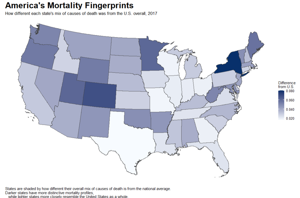
America’s Most Unusual States
To find the states with the most distinctive mortality fingerprints, we calculated a mortality profile strangeness score for each state.
The score measures how far a state’s mix of causes of death differs from the national pattern. A lower score means the state looks more like the United States overall. A higher score means the state has a more unusual combination of causes of death.
In 2017, Alaska stood out more than any other state. Its mortality profile was shaped by a much larger share of deaths from unintentional injuries and suicide, and a much smaller share from heart disease. New York ranked second, driven largely by a higher-than-expected share of heart disease deaths. The District of Columbia, Colorado, and Hawaii rounded out the top five.
| Rank | State | Strangeness Score | What Drove the Difference |
|---|---|---|---|
| 1 | Alaska | 0.093 | Unintentional injuries higher; heart disease lower; suicide higher |
| 2 | New York | 0.081 | Heart disease higher; Alzheimer’s lower; stroke lower |
| 3 | District of Columbia | 0.077 | Heart disease higher; chronic lung disease lower; unintentional injuries higher |
| 4 | Colorado | 0.069 | Heart disease lower; unintentional injuries higher; suicide higher |
| 5 | Hawaii | 0.064 | Influenza and pneumonia higher; chronic lung disease lower; stroke higher |
| 6 | Utah | 0.061 | Cancer lower; suicide higher; Alzheimer’s higher |
| 7 | Minnesota | 0.061 | Heart disease lower; cancer higher; Alzheimer’s higher |
| 8 | Maine | 0.057 | Heart disease lower; cancer higher; chronic lung disease higher |
| 9 | Oregon | 0.055 | Heart disease lower; cancer higher; Alzheimer’s higher |
| 10 | Wyoming | 0.054 | Chronic lung disease higher; heart disease lower; suicide higher |
| 11 | Washington | 0.051 | Heart disease lower; Alzheimer’s higher; kidney disease lower |
| 12 | West Virginia | 0.051 | Unintentional injuries higher; heart disease lower; chronic lung disease higher |
| 13 | Vermont | 0.048 | Cancer higher; Alzheimer’s higher; kidney disease lower |
| 14 | Oklahoma | 0.048 | Heart disease higher; cancer lower; chronic lung disease higher |
| 15 | Maryland | 0.047 | Alzheimer’s lower; heart disease higher; cancer higher |
Notice that many of these states are not necessarily the sickest states. They are simply the most different.
Why Is Alaska So Different?
At first glance, Alaska’s position at the top of the rankings is surprising. It isn’t the nation’s most populous state, nor is it typically the first place people think of when discussing America’s leading causes of death.
Its mortality fingerprint tells a different story.
Compared with the United States as a whole, unintentional injuries account for a dramatically larger share of deaths in Alaska. That difference alone is enough to distinguish the state from much of the country. Suicide also represents a substantially larger share of deaths than expected, while heart disease accounts for a much smaller proportion of deaths than it does nationally.
Those three causes—injuries, suicide, and heart disease—combine to create a mortality profile unlike any other state.
Importantly, this does not mean Alaskans are necessarily more or less likely to die overall. Instead, it means that the balance of causes of death is different. If you randomly selected 100 deaths in Alaska and 100 deaths nationally, you would find a noticeably different mix of underlying causes.
Once you understand Alaska, the rest of the map begins to make sense.
Every state has its own unique combination of overrepresented and underrepresented causes of death. Some states have more heart disease than expected. Others have relatively more cancer, Alzheimer’s disease, chronic lung disease, or accidents. These combinations create distinctive mortality fingerprints that are often invisible when we focus only on overall death rates.
Figure 3 compares the fifteen most distinctive states. Each row represents a state, and each column represents one of the major causes of death. Red cells indicate causes that account for a larger share of deaths than expected compared with the national average, while blue cells indicate causes that account for a smaller share. The darker the color, the larger the difference.
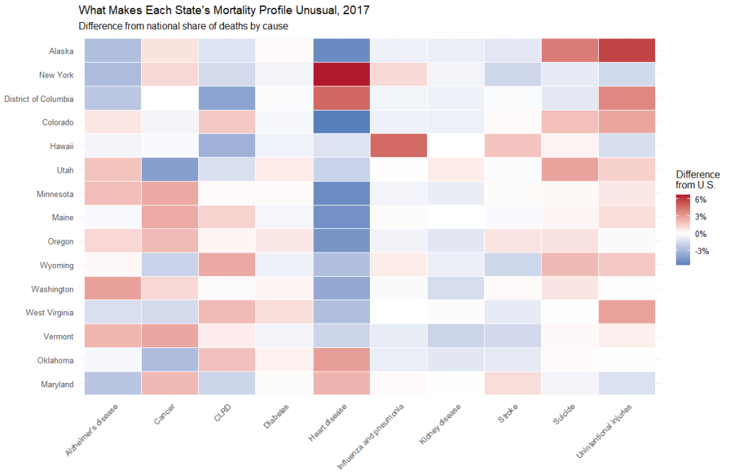
Suddenly, patterns emerge.
Alaska stands apart because of injuries and suicide. New York is characterized by an unusually large share of heart disease deaths. Hawaii’s profile is heavily influenced by influenza and pneumonia. Utah’s fingerprint reflects relatively fewer cancer deaths but more deaths from suicide. West Virginia, meanwhile, stands out because injuries and chronic lung disease play a much larger role than they do nationally.
Rather than fifty versions of the same story, the United States begins to look like fifty distinct mortality landscapes.
Every State Has a Mortality Signature
If you had to describe a state’s mortality profile using only two causes of death—one that occurs more often than expected and one that occurs less often than expected—could you still recognize it?
Surprisingly, the answer is often yes.
Just as every person has a unique fingerprint, every state has a distinctive combination of causes that define its mortality profile. Sometimes the differences are dramatic. In other cases, they’re subtle but remarkably consistent.
Alaska’s signature is immediately recognizable: a much larger share of deaths from unintentional injuries paired with a much smaller share from heart disease. New York tells a different story, with heart disease playing a much larger role than expected while Alzheimer’s disease accounts for a smaller share of deaths. Hawaii stands apart because of an unusually large contribution from influenza and pneumonia, while Utah’s signature is shaped by higher suicide mortality and lower cancer mortality.
These pairings create a surprisingly memorable portrait of each state. The below highlights the dominant mortality signature for twenty states. Rather than comparing dozens of statistics at once, it distills each state’s fingerprint into its most defining features.
| State | More Than Expected | Less Than Expected |
|---|---|---|
| Alaska | Unintentional injuries | Heart disease |
| New York | Heart disease | Alzheimer’s disease |
| District of Columbia | Heart disease | Chronic lower respiratory disease |
| Colorado | Unintentional injuries | Heart disease |
| Hawaii | Influenza & pneumonia | Chronic lower respiratory disease |
| Minnesota | Cancer | Heart disease |
| Maine | Cancer | Heart disease |
| Utah | Suicide | Cancer |
| Oregon | Cancer | Heart disease |
| Washington | Alzheimer’s disease | Heart disease |
| Oklahoma | Heart disease | Cancer |
| West Virginia | Unintentional injuries | Heart disease |
| Wyoming | Chronic lower respiratory disease | Heart disease |
| Arkansas | Chronic lower respiratory disease | Cancer |
| New Jersey | Heart disease | Chronic lower respiratory disease |
| North Dakota | Alzheimer’s disease | Heart disease |
| New Mexico | Unintentional injuries | Heart disease |
| Maryland | Heart disease | Alzheimer’s disease |
| Vermont | Cancer | Kidney disease |
| Alabama | Heart disease | Cancer |
Several themes begin to emerge almost immediately.
Heart disease appears repeatedly as the condition that is underrepresented in many of the country’s most distinctive states, particularly across the West and Upper Midwest. Meanwhile, unintentional injuries define several western and Appalachian states, while heart disease becomes the dominant distinguishing feature in parts of the Northeast and South.
These signatures also illustrate an important point: two states can have similar overall health outcomes while arriving at them through very different disease patterns. Looking only at life expectancy or overall mortality can obscure these differences. Mortality fingerprints reveal the unique public health story each state has to tell.
America’s Mortality Landscape Is Changing
A mortality fingerprint isn’t frozen in time.
States evolve. Medical advances, changing lifestyles, public health policies, demographic shifts, and emerging epidemics all reshape the mix of diseases that claim lives. The question is whether those changes are making states more alike—or more different.
To answer that, we calculated each state’s mortality fingerprint every year between 1999 and 2017 and tracked how far it diverged from the national average.
The results reveal two competing trends.
Some states have gradually become more distinctive, developing mortality profiles that increasingly differ from the rest of the country. Others have slowly converged toward the national average, suggesting that their mix of causes of death is becoming more typical over time.
Figure 5 shows the trajectory for every state. Each gray line represents one state’s mortality fingerprint over the study period. Although the individual paths vary, the figure makes one thing immediately clear: America’s mortality landscape is constantly changing.
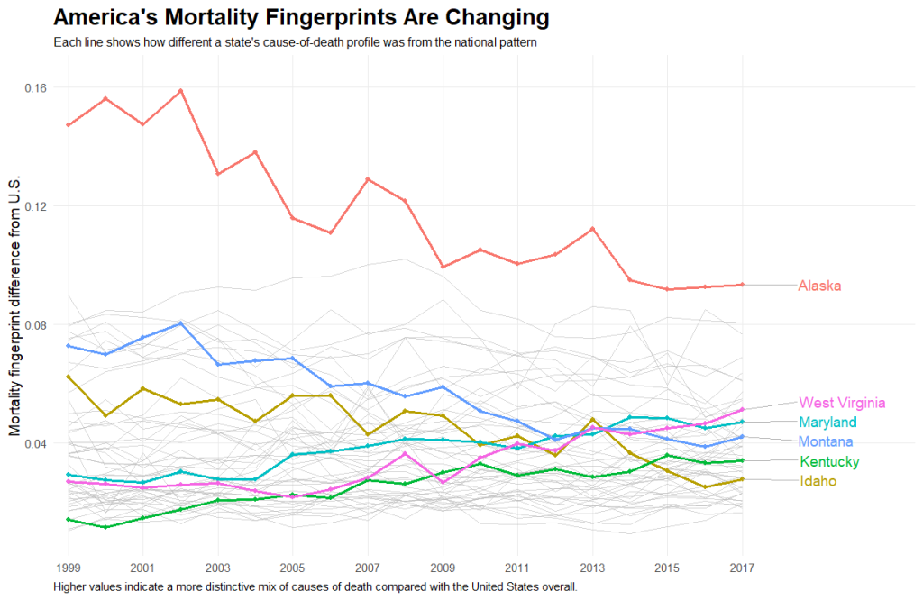
While the overall picture is informative, the most interesting stories emerge when we look at the extremes.
Some states are rapidly becoming statistical outliers. Others are steadily blending into the national pattern.
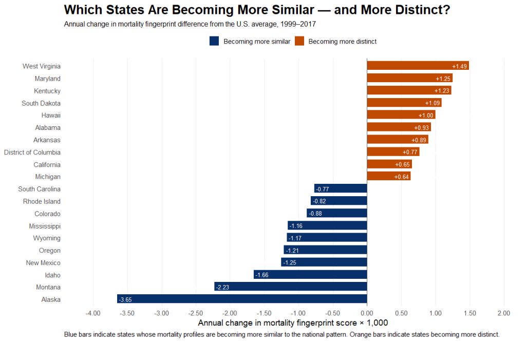
States Becoming More Distinctive: These states experienced the largest increases in their mortality fingerprints over the study period, meaning their mix of causes of death drifted further from the national average.
States Becoming More Typical: These states moved in the opposite direction. Their mortality fingerprints became increasingly similar to the United States as a whole, suggesting that the composition of deaths is slowly converging toward the national pattern.
One finding stands out.
Alaska remains America’s most distinctive mortality profile, yet it has actually become more similar to the rest of the country over time. Meanwhile, several states that were once relatively typical—including parts of Appalachia and the Mid-Atlantic—have become increasingly distinctive, reflecting changing patterns of chronic disease, injuries, and other causes of death.
This reminds us that mortality fingerprints are not fixed characteristics. They evolve alongside the populations they represent, revealing how America’s public health landscape is continuously being reshaped.
Which State Is Your State’s Twin?
If every state has its own mortality fingerprint, one question naturally follows:
Which state looks the most like yours?
To answer that question, we compared every state’s complete mortality fingerprint with every other state’s. Rather than focusing on a single disease, we compared the entire mix of major causes of death and identified the closest match for every state.
The result is below. Each line connects a state to its closest mortality twin—the state whose overall pattern of causes of death most closely resembles its own.
Unlike a traditional map of geography or politics, this network reveals hidden relationships in American health. Some connections link neighboring states with similar populations and health challenges. Others bridge states separated by hundreds or even thousands of miles, suggesting that geography alone cannot explain how Americans die.
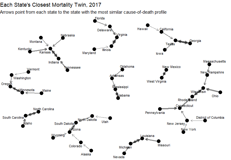
Several relationships immediately stand out.
Some pairings are exactly what you might expect. North Carolina and South Carolina emerge as close relatives, as do Alabama and Mississippi. Their shared demographics, culture, and health challenges produce remarkably similar mortality fingerprints.
Other pairings are far more surprising.
Georgia is most closely linked with Texas, despite sharing borders with four other states. Minnesota finds its closest match in Oregon, more than 1,500 miles away. Even more unexpected, Louisiana and Michigan emerge as one of the strongest mortality twin pairs despite their vastly different histories, climates, and economies.
Why Are They Twins?
The answer lies beneath the network.
Take Georgia and Texas, the closest pair identified in our analysis. Their mortality fingerprints are nearly identical because deaths from cancer, diabetes, and suicide occur in almost exactly the same proportions. The largest remaining difference comes from heart disease, but even there the gap is relatively modest.
A similar pattern appears for Minnesota and Oregon. Although separated by much of the continental United States, both states have nearly identical shares of deaths from influenza and pneumonia, chronic lower respiratory disease, and kidney disease. Small differences in heart disease and unintentional injuries are enough to distinguish them, but not enough to outweigh their overall similarity.
Perhaps the most surprising pairing is Louisiana and Michigan. They share remarkably similar mortality contributions from diabetes, suicide, and influenza and pneumonia, even though few people would naturally associate the two states with one another.
These unexpected connections reveal something important.
Public health challenges do not always follow regional boundaries. States that appear culturally or geographically distinct can exhibit strikingly similar disease patterns, while neighboring states sometimes develop markedly different mortality fingerprints.
Looking at mortality through the lens of relationships rather than rankings shifts the conversation. Instead of asking which state is healthiest or least healthy, we can ask a more useful question:
Which states are fighting the same battles—and what can they learn from one another?
Geography Doesn’t Tell the Whole Story
It’s tempting to assume that neighboring states share similar public health challenges.
After all, nearby states often have comparable climates, economies, cultures, and health care systems. Geography certainly matters.
But our analysis shows it isn’t the whole story.
Some of the strongest mortality twin pairings crossed expectations.
Florida’s closest match wasn’t Georgia or Alabama—it was Delaware.
California, despite its unique size and demographics, most closely resembled Texas (though maybe that’s not surprising?)
Utah’s mortality fingerprint aligned more closely with North Dakota than with any of its Mountain West neighbors.
Even Pennsylvania found its closest match in Connecticut, rather than nearby states like Ohio or New Jersey.
At first glance, these pairings seem almost counterintuitive.
How can states separated by hundreds—or even thousands—of miles share remarkably similar mortality fingerprints? The answer is that mortality patterns emerge from far more than geography.
Population age, socioeconomic conditions, access to health care, occupational risks, behavioral factors, and long-term demographic trends all influence the balance of diseases that ultimately claim lives. Two states can arrive at remarkably similar mortality profiles through very different histories, while neighboring states may gradually diverge as their populations change.
This perspective offers a useful reminder for public health professionals.
When searching for successful interventions, the best comparison may not always be the state next door. A geographically distant state with a nearly identical mortality fingerprint may offer more relevant lessons, more appropriate policies, and more meaningful benchmarks.
In other words, America’s public health landscape is organized not only by geography—but also by shared patterns of disease.
Sometimes, your state’s closest public health relative lives much farther away than you would ever expect.
Conclusion
Public health often compares states using a single number.
Life expectancy. Obesity prevalence. Smoking rates. Drug overdose deaths.
These metrics are enormously valuable, but they inevitably simplify a much more complex reality.
No single disease defines a state.
Instead, every state possesses its own mortality fingerprint—a unique combination of causes of death shaped by its demographics, history, environment, economy, health care system, and countless other influences. Two states may have similar overall mortality rates yet arrive there through remarkably different patterns of disease. Conversely, states separated by thousands of miles may share nearly identical mortality fingerprints, revealing common public health challenges that geography alone cannot explain.
Looking at mortality through this broader lens changes the questions we ask.
Instead of focusing only on which states have the highest or lowest death rates, we can begin asking why states differ, how those differences evolve over time, and which states might learn from one another because they share similar health challenges.
Our analysis suggests that the United States is not defined by a single national mortality story. It is a collection of dozens of distinct public health landscapes—some converging, others diverging, each reflecting a unique intersection of biology, behavior, policy, and place.
Every state has its own mortality fingerprint.
Taken together, those fingerprints reveal an America that is simultaneously more connected—and more diverse—than most of us realize.