Infographics: Making Health Messages Stick
Health education is vital in our ongoing fight against diseases, including complex ones like dementia. But how do we ensure that important health messages are not just heard but understood and retained? A recent study delves into this question, exploring the potential of infographics to make dementia risk prevention messages more accessible, especially for individuals who speak English as an additional language.
The Power of Visual Learning
The research highlights the concept of “infographing”—transforming text-heavy health messages into visual formats that are easier to digest. Infographics blend images, charts, and minimal text to communicate messages effectively, leveraging human beings’ innate preference for visual learning. This method can simplify complex information, making it more relatable and easier to remember.
Why Dementia Prevention?
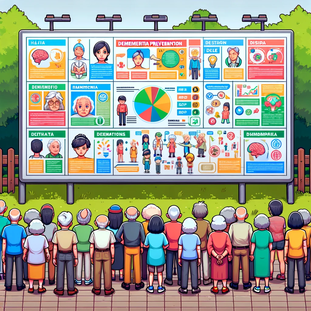
Dementia affects millions worldwide, but awareness about its prevention is still low. Research has identified 12 modifiable risk factors that could potentially prevent or delay up to 40% of dementias. However, these messages haven’t yet penetrated the general consciousness effectively. This study aims to change that by crafting messages that resonate more through visual aids.
Co-Design: Collaborating for Clarity
One of the study’s significant strategies was co-design, involving the target audience in the creation process. This approach not only garners insights from those who the messages intend to help but also makes the final product more tailored and impactful. Participants from various backgrounds contributed to refining the messages, ensuring they were understandable across different cultures and linguistic backgrounds.
During several co-design sessions, participants reviewed and provided feedback on infographic prototypes. This collaborative effort led to adjustments in imagery and terminology, making the infographics more inclusive and easier to grasp. The themes developed from these sessions—“all hands on deck,” “charting the course,” and “get on board”—emphasize the participatory nature of the process and the goal of achieving clarity and connection through co-design.
Visuals That Connect and Educate
The study found that realistic, colorful visuals were more effective than simple black-and-white drawings. These detailed images help viewers connect with the material on a personal level, seeing themselves or their loved ones in the scenarios depicted. This personal connection is crucial for message retention and motivation.
Moreover, the use of color and realistic imagery helps highlight diversity, making the infographics resonate with a broader audience. Participants suggested that these visuals could include diverse representations in terms of age, ethnicity, and lifestyle, further broadening the reach and impact of the health messages.
Engaging the Community
The infographic approach does more than just inform—it engages. By designing materials that are visually appealing and easy to understand, the project aims to inspire people to share the information within their communities, extending the reach of critical health messages far beyond the initial audience.
Toward a Healthier Future
This research underscores the importance of engaging with the community when creating health education materials. By involving those who the messages aim to help, we can ensure that the information is not only accessible but also compelling and relevant.
The study’s findings could be a blueprint for other health communication efforts, suggesting that the personal touch in message design could significantly impact public health initiatives.
Let us hear from you in the comments!
- How can we apply the principles of co-design to other areas of public health education?
- In what ways might we improve the inclusivity of health infographics to cater to a wider range of linguistic and cultural backgrounds?
Become a Health Innovator – Get Weekly Updates!
Join the forefront of public health innovation with “This Week in Public Health.” Each issue keeps you up-to-date with the latest in research, community health, and advocacy. This newsletter is more than just updates – it’s your tool for being an informed and active member of the health community. Subscribe for free and be part of a group dedicated to making a real difference in public health.
About the Author
Jon Scaccia, with a Ph.D. in clinical-community psychology and a research fellowship at the US Department of Health and Human Services with expertise in public health systems and quality programs. He specializes in implementing innovative, data-informed strategies to enhance community health and development. Jon helped develop the R=MC² readiness model, which aids organizations in effectively navigating change.