
What’s going on in Health Equity?
As health equity researchers, we are often interested in health-related topics. It can be difficult to keep up with all the research out there! But at least every day you have a chance of finding something new that interests you or informs your work, right?
This blog post is going to be a recap of the last 30 days of health equity research. It will talk about the scientific articles, but also things from Twitter and other news sources. There is a ton of research out there and this condenses it down into manageable chunks so that no one misses anything important! However, they aren’t organized in a way that allows you to determine what works and what doesn’t. That’s something we really enjoy doing here at PubTrawlr. Let’s get started.
Academic Research.
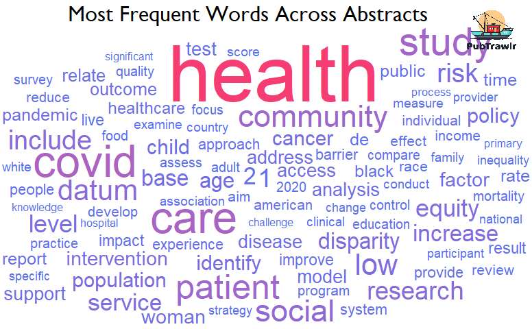
In the past 31 days, there have been 347 articles spread across 202 journals. This first figure shows the 100 most frequent words that occur across all the abstracts visualized as a wordcloud. In a wordcloud, the size of the word corresponds to how frequently it occurs.
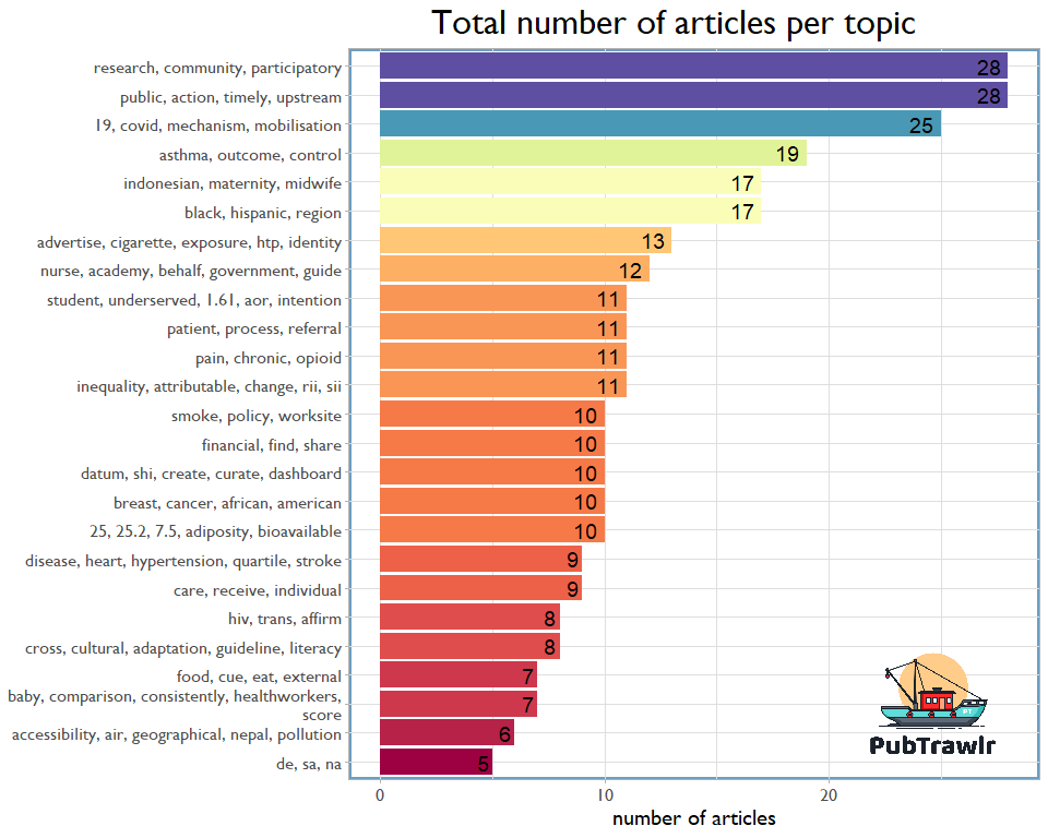
I then organized the articles by topic. The most popular themes, which each featured 28 contributions, included upstream and community-based participatory research. We also discovered several specialized topics, such as maternal health in Indonesia, sexual health and HIV, and worksite smoking policy.
The topics are connected with a correlations matrix in the following figure. Green lines indicate a positive correlation, while red lines indicate a negative one. The overall line’s thickness is equal to the absolute strength of the relationship, which we can see from the red and green lines. CBPR articles have been linked to upstream action and certain policy initiatives, but it was negatively linked to the Indonesian (or global) maternal health research.

So, health equity topics aren’t actually closely related to each other! But we do see a lot of similar words here. This is because these were all health-related topics and so it makes sense that they would have some overlap in their language use. We can also clearly see which research areas are more health-oriented versus policy or community-oriented.
Finally, as an experiment, I trained a list of word vectors using the abstracts as input. What word vectorization does is reduce each work to a 128-dimensional series of 1 and 0s that preserves a huge amount of data on how concepts are related to one another. I then plotted the 30 most frequent words in 2-dimensional space to see how they related to one another.
Some of the relations make a lot of intuitive sense, like “factor” and “analysis” being closely related. It was super interesting to see “disparity” and “equity” so far apart, which may be the recognition that equity is about more than just finding disparities?

The news
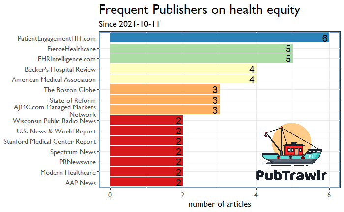
Let’s move on to what is reported in the mainstream news. The API limits my pull to the last 100 articles (which I’m working on getting around), but works for our purposes. This first figure shows who is publishing on health equity. We observe a few “more general” publications in addition to the highly specialized ones.
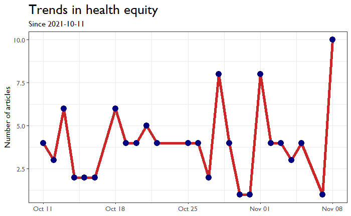
This graph shows the frequency of publications, which generally appear to be pretty steady with a substantial number (8) published just the day I wrote this blog.
While it’s a little difficult to compare the journal wordcloud to news wordcloud, several keywords jump out here, most notably “vaccine” and, duh, “equity.”

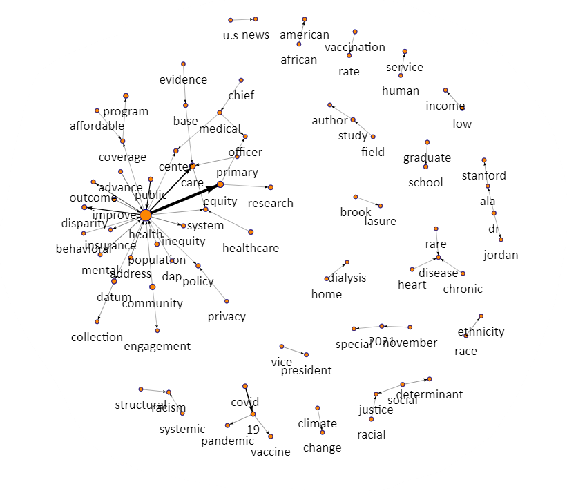
I also utilized a network plot to examine key terms. We may see several health problems (COVID, kidney disease, and chronic health conditions), as well as contextual situations (structural racism and climate change).
I also grouped these articles, which wasn’t very interesting. Some of the articles may report on recent NIH study findings.

Twitter:
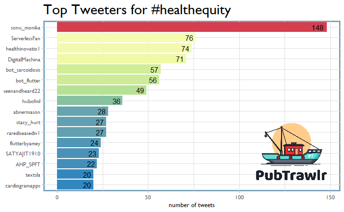
Now the twitter results were frankly nuts. I first pulled all the tweets over the past week flagged with #healthequity. I then plotted the most frequently occurring words and phrases. Looking below, this is super tech-heavy. I like a bunch of this stuff (after all, this post does a number of Natural Language Processing algorithms), but did not expect this volume of tech-specific discourse.
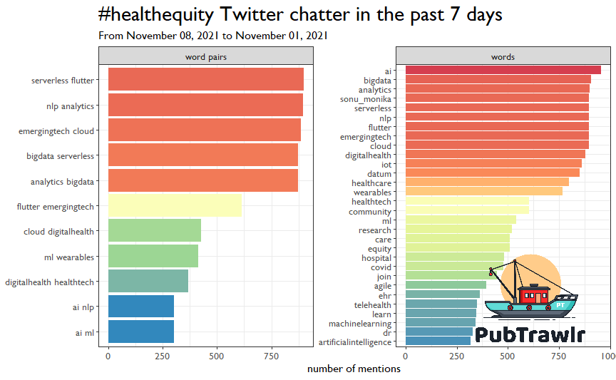
Looking at who was doing the Tweeting, it should then come as no surprise that some tech accounts comprised a lot of the content. @sonu_monika runs a digital health firm Health Innovation Toolbox, so check it out!
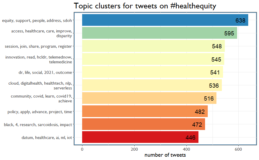
I organized the tweets as well. These categories make more sense. We have a lot of stuff on issues like SDOH and healthcare access, which appear to be separate topics for the technology tweets
Summing Up!
It’s important to have a variety of sources, so I’ve tried to provide as many different perspectives on the topic as possible. The information is only useful if you are able to access it and understand what it means for your life or applied research goals. PubTrawlr can help with that by offering tailored content based on your interests. Let us know how we’re doing in the comments below or on social media!